To solve common problems that arise during community engagement projects, Studio Luz implements an online approach to outreach, using municipality websites in tandem with other initiatives and programming to provide essential information to and receive thoughts and feedback from community members. From the interactive and informative website we created and populated for Campello Neighborhood Plan to the community engagement assets we created for Shirley Ave Revere to the online surveys we made available to the people of Boxford, Revere, and Lynn, these hubs for online communication are proving to be an essential part of making sure that each of these projects are as transparent as possible. Project Manager and Marketing + Community Liaison Sophie Nahrmann explains how these municipality websites can benefit everyone who touches a project, from leaders to designers to the community at large.
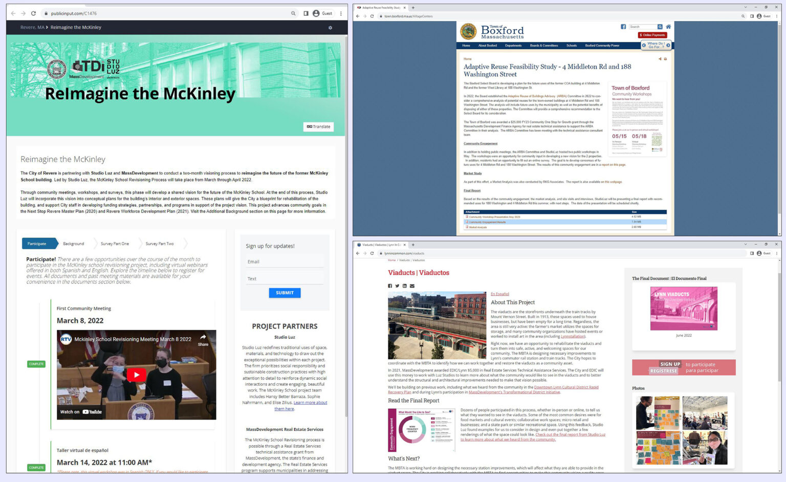
Municipality websites for projects in Revere, Boxford, and Lynn allow community members to access key information, like survey results, reports, and meeting recordings.
What goals do you have in mind when you create a website for a municipality project?
The primary goal for a site like the Campello Neighborhood Plan is to create a landing page that anybody can go to to stay informed, and to have transparency with the community about what’s going on in the process. That’s a piece of criticism that’s been made about different community processes, not specific to Brockton, but industry-wide in terms of community engagement — that it feels very exclusive, with little transparency. With these sites, we are promoting a greater degree of transparency, allowing anyone who is interested in what’s going on to be able to see the findings from workshops, plus presentations and updated information as the project progresses.
We also make sure to have assets in multiple different languages, as oftentimes communities feel disenfranchised because the invitations aren’t directed towards them in their language. Lastly, having an interface that is readily accessible is essential — with a site like this, you can link to it off of social media posts and in bios, and you can also access it via QR codes off of posters and the postcards we mail out. It’s just like one central hub that has the information in a way that’s accessible to as many people as possible.
Our site for the Campello Neighborhood Plan provides a centralized space for the project that promotes information sharing and transparency with the community.
What are some top priorities when creating a site like this?
What we prioritize with these projects is our engagement and continuous updating of the website. That’s the most important. As we move through the process, we find more opportunities to share information — for instance, for the McKinley School project in the City of Revere, we found that it was useful to include a video recording of our first workshop meeting that was also broadcast on public television, so that’s a living record there that people can understand. For subsequent workshops, we have all of our results from the previous meetings up on the site. It’s all about the continuous iteration of it, so that there’s always new updates to see. Talking through what that engagement is going to look like is always part of the dialogue we have with the clients. We do advocate for a lot more of these engagement items as part of the website and integrating that within that process.
What are some of the ways that Studio Luz has seen the use of these websites improve community communication, transparency, and outcomes?
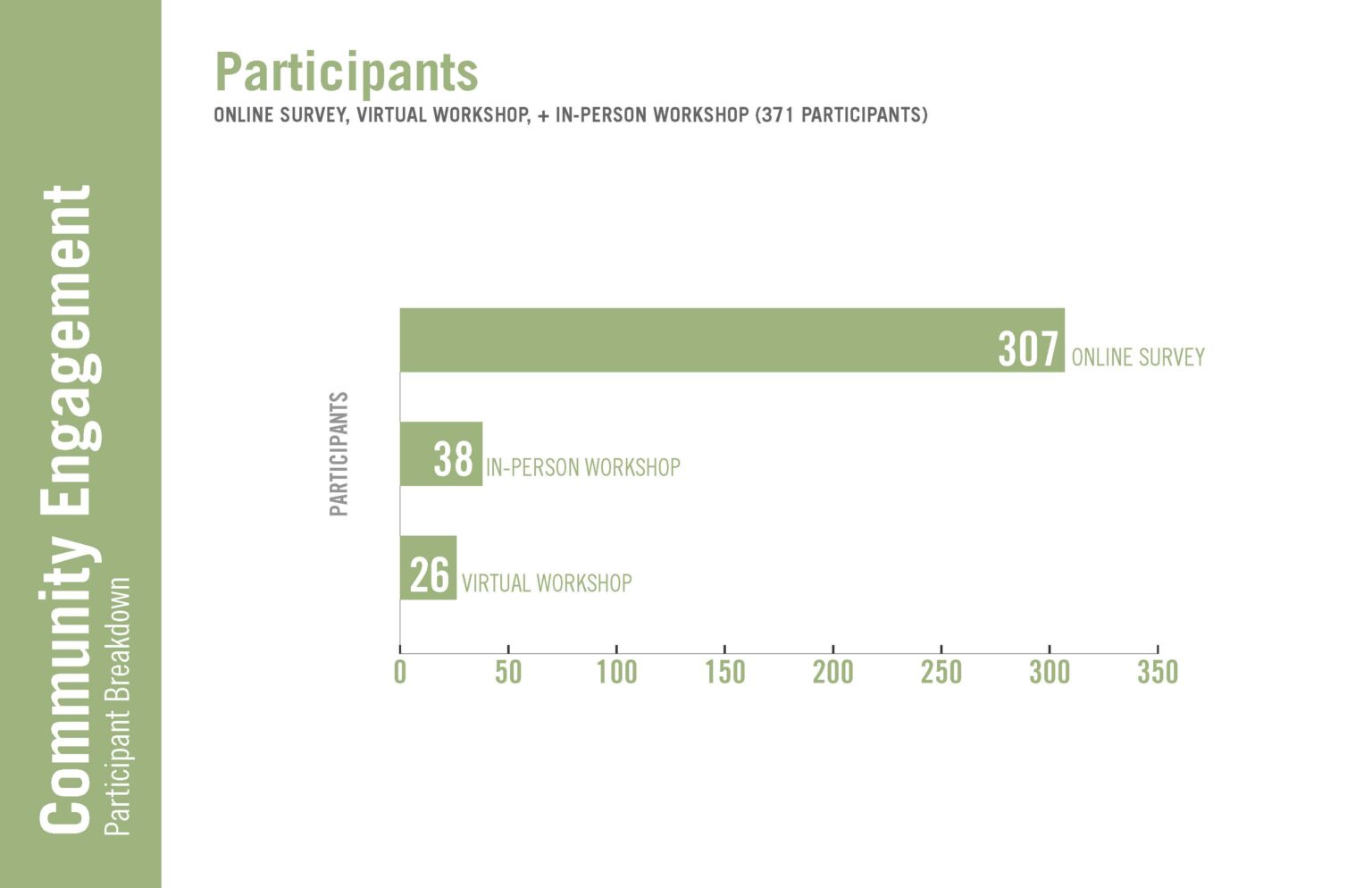
Sometimes members of the steering committee can’t attend a meeting but still want to make their voice heard, and a forum like this, which includes online surveys that can be completed anytime, allows for a lot more asynchronous engagement. The number of people who are able to make an in-person meeting and share their voice is limited because it’s a single date and a single time. Having the website available when those people are available, we get many — sometimes hundreds — more responses than the number of people that typically attend a single meeting. In the case of the Boxford survey (illustrated below), we received 307 online survey responses, compared to the 38 in-person workshop attendee responses and 26 online virtual workshop attendee responses. This clearly demonstrates that these online surveys allow us to get a much broader swath of information and hear voices from people who may not have been able to attend, due to childcare constraints or scheduling or just not being able to commit an hour and a half to come to our presentation at the exact time we specified. Hearing that diversity of voices makes for much more comprehensive design proposals afterwards, because we’re hearing all of the community and are able to really synthesize a vision that will ultimately get a lot more buy-in from that community.
What are some important considerations to keep in mind for a successful municipality website?
So many of our communities are very diverse, and we have high immigrant populations in many areas we work in. It’s so important to lean on translating, including your in-person meetings and your online content, in order to be as fully accessible and welcoming as possible. Many times, people will feel that they are not welcome or included within the process unless they’re directly invited, and speaking to people in their language is the easiest and first step in making them welcome. That’s really critical, whether it’s online or in person.
We also think about promoting it as many places as possible. Working with leaders in each community to steer people towards these resources can be a helpful, supportive part of the process. We also make sure to share these sites widely on social media, and often will implement postcard campaigns, mailing postcards to property owners and businesses in the district right at the outset of the projects that had all of the workshop dates and times as well as a QR code and the website linked. In addition to that, we will hang posters in a lot of the storefronts right along the district that we’re focusing on, in an effort to have it visible all the time so that you get the casual passerby to engage.
What happens to the websites once the project is completed?
Something wonderful that happens is that these websites really become a capacity building tool for the cities or districts that we’re working with. These websites become something that they can build upon and continue to use, both throughout the process and also long after the project is completed. What we want is the city to have this tool that fosters people’s trust with the city, that helps show that they are transparent in their process and they’re engaging me throughout the process. Even past the project deadlines, once everything has been implemented and it’s 10 years down the line, people can still go to the website and see exactly where their voice was heard.
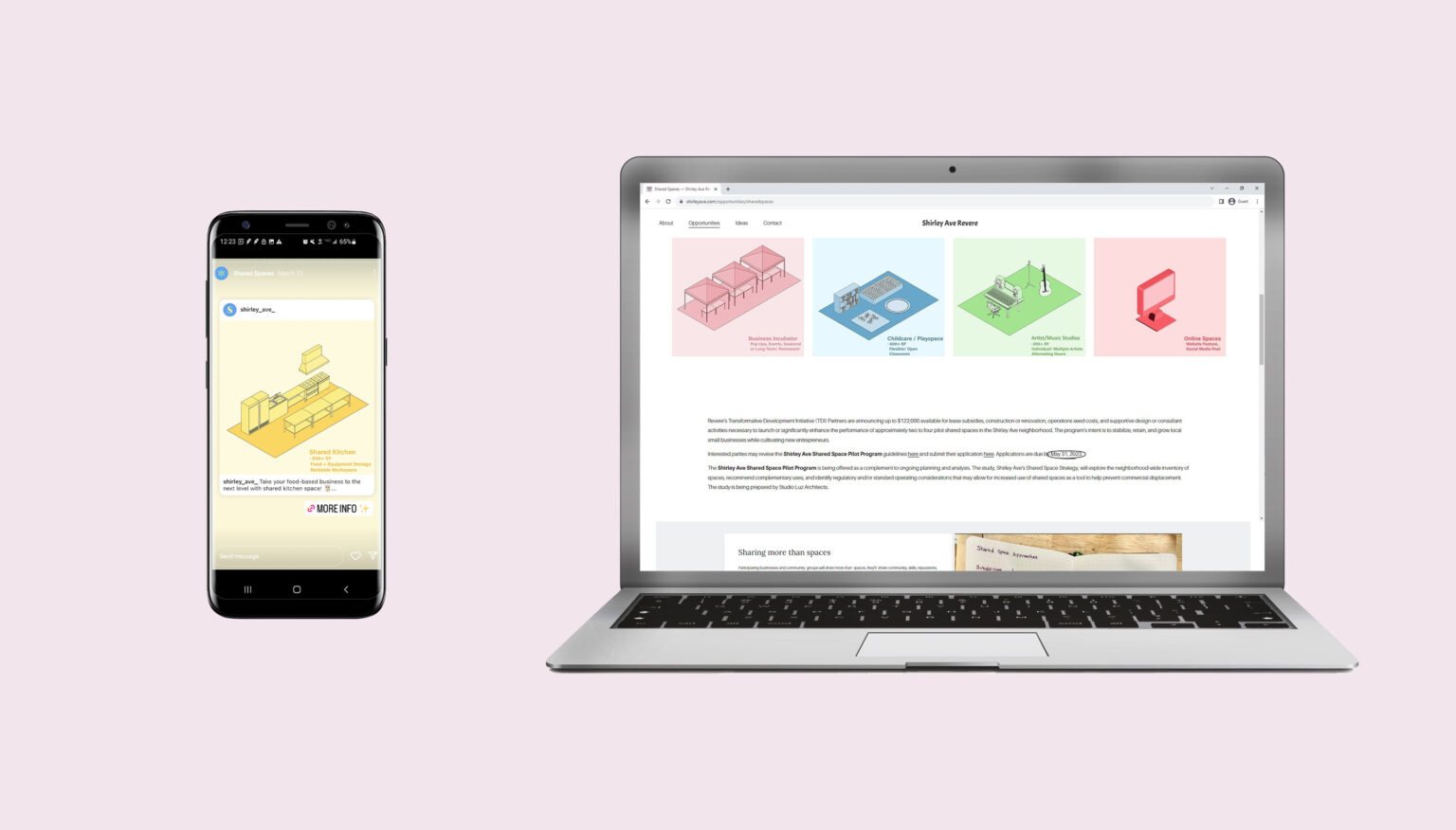
This landing page for the Shirley Ave Revere project, with assets by Studio Luz, illustrates how shared spaces can directly benefit the community and encourages interested parties to get involved.