By funkhaus
An interview with Studio Luz Architects’ Sarah Pumphrey on the history of Universal Design Principles and how universities can apply them.
With each project we take on, Studio Luz aims to use design to promote equity and belonging, strengthen community, give agency to those using the space, and to address details that may otherwise be overlooked. To unify our approach, Designer and Project Manager Sarah Pumphrey crafted a set of universal design principles to guide our office through each and every project we take on.
What are the universal principles of design?
Universal Design aims to design for everyONE, regardless of abilities, neurodiversity, age, gender, sexuality, race and ethnicity. Our design of our public spaces should follow these principles:
* Reference: “Human Rights Careers: What Is Inclusive Architecture?”
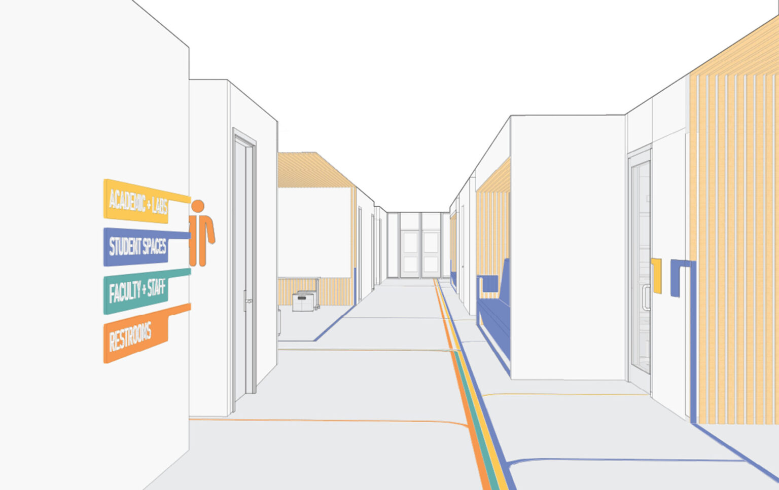
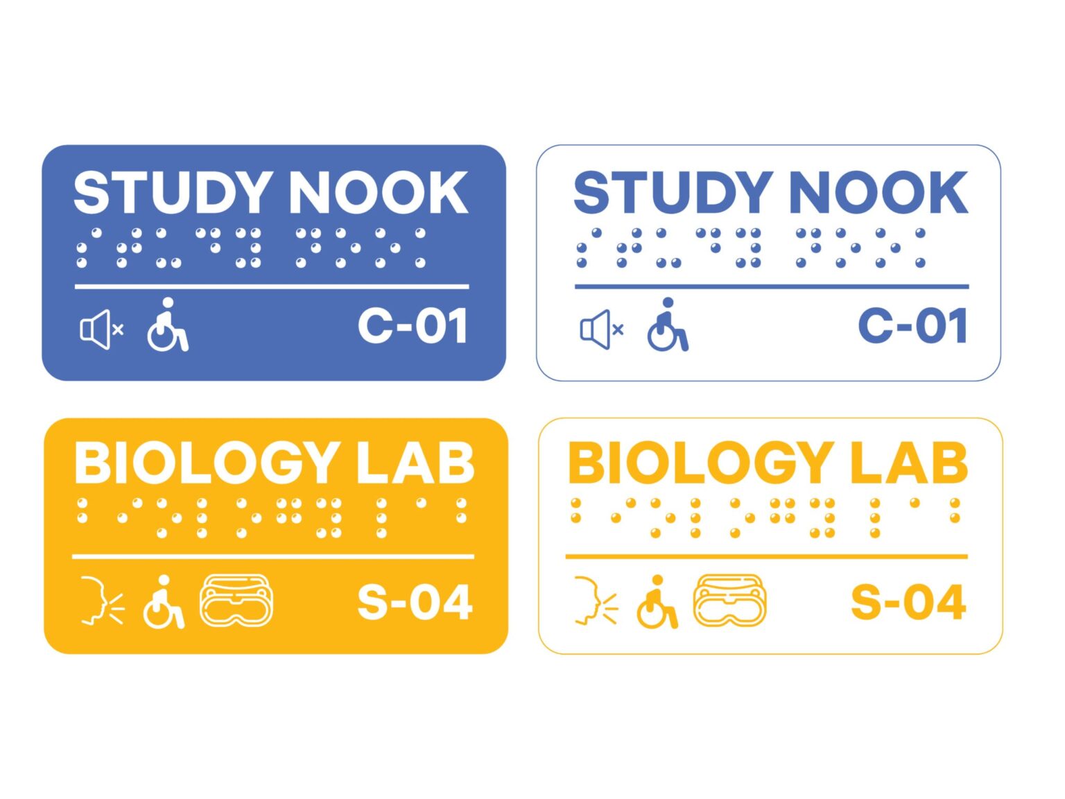
Universal design in higher education spaces can include considerations like easily found accessible routes and highly legible wayfinding with multiple languages, icons, and braille.
Tell us more about where these principles came from, and what the impetus was for standardizing them at Studio Luz.
At Studio Luz, we use universal design as the standard in our practice, for all of our projects, as much as we can. The term “universal design” was coined decades ago by Ronald Mace, and though it can mean many things, for us it just means that we’re designing for everyone using a given space, and that we’re making sure that everyone can use the space comfortably. The catalyst for standardizing these is an educational project we are currently working on with Jones Architecture. We had a presentation given by KMA, a leading national firm that specializes in universal design, and together with DCAMM, we were asked about our thoughts on universal design. We thought it was a great prompt to gather our staff together and talk about what universal design meant to us as a firm, from physical accessibility of entrances and exits to neurodiversity needs of students in educational spaces. What came out of those discussions, as well as from our community engagement work, are our principles.
There are some general principles that have been around for many years, like flexibility, accessibility, comfort, and safety, but something additional that we wanted to do after speaking with students and professors on a particular educational project was to make sure we bring equity and inclusion into the universal design conversation. Today, people in the field are having conversations that factor in intersectionality. We’re talking not only about physical ability and comfort in a space, but also feeling like you belong and you’re being respected in a space. This is a difficult task for architects, but it’s also a really exciting challenge that we get to meet.
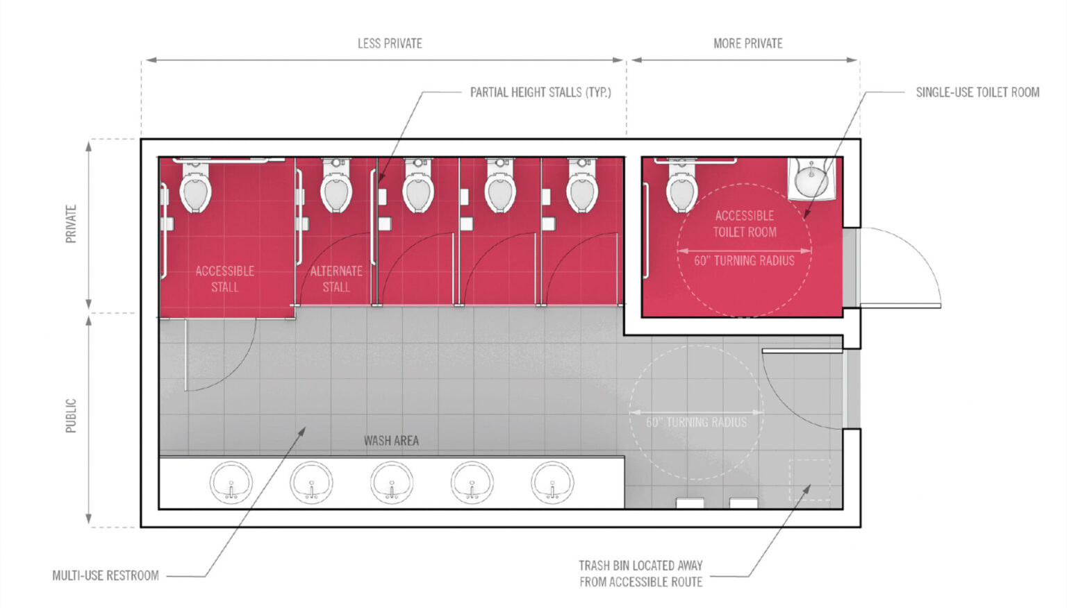
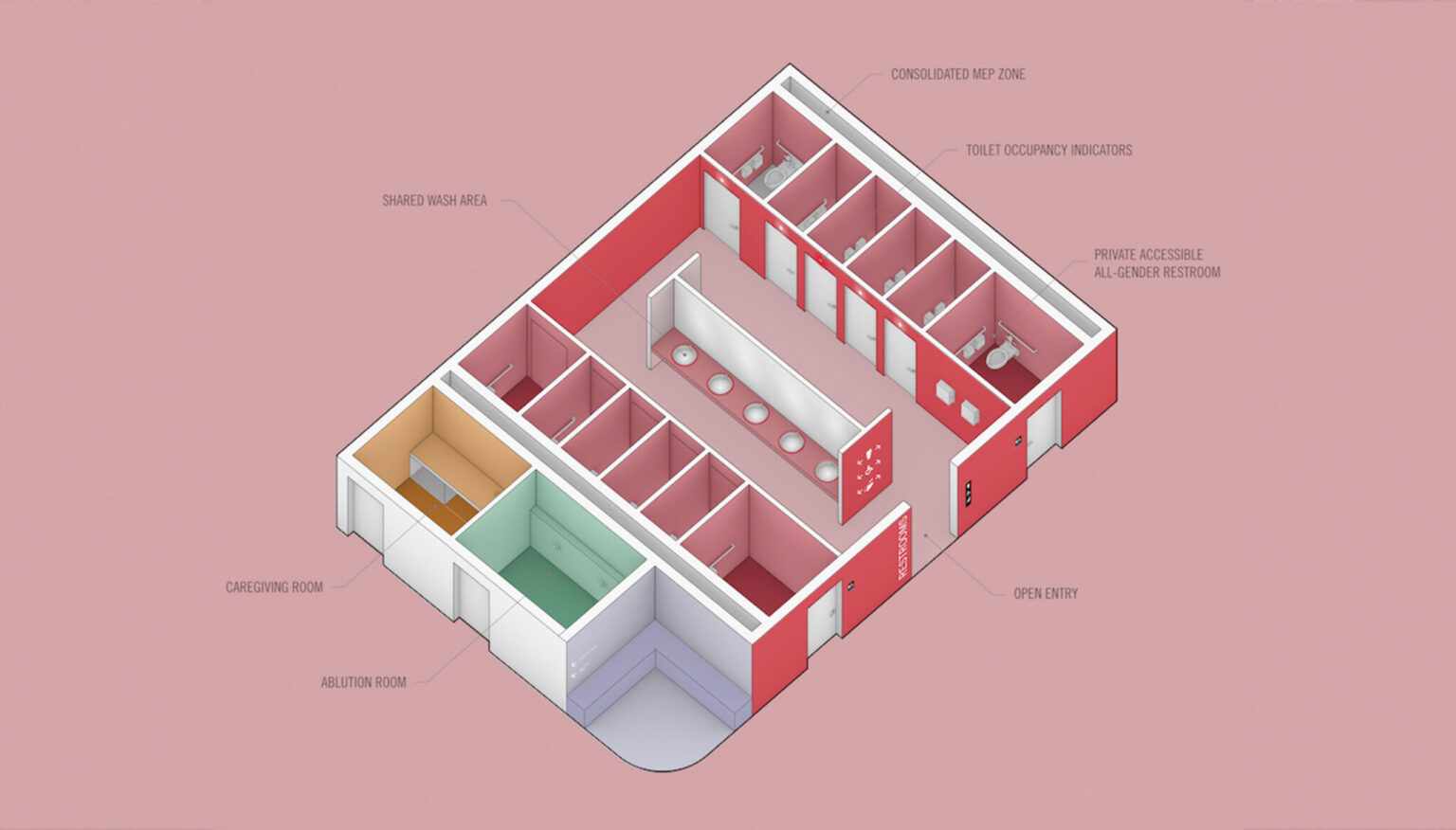
Our designs for accessible restrooms at Northeastern account for a variety of needs and includes private areas and all-gender designation.
Why is universal design important in the context of an educational setting?
People in educational settings need to be comfortable, they need to be without distraction, and they need to feel like that space is theirs in order to learn productively. As designers, we need to think about creating that blank slate for everyone to be able to learn effectively. For this type of project, we ask the client and students questions about their relationship with the space, like what is going to help you be most productive in this space? Do you need closed study spaces that are sound insulated, or do you need to be out in the open so you can study with your friends and bounce things off of one another? Through community engagement, we’re gleaning essential knowledge from the students that are actually going to use the space, and also hearing from instructors about needs for teaching in the space. For educational settings, it’s all about being flexible and knowing that some of these standards are currently changing or are going to change.
When the term universal design was coined, it was in reference to the domestic sphere: it was about allowing everyone to be comfortable and able to use their home as easily as their neighbor. Mace himself had polio and was physically impaired as a result, and he just wanted to use his home. In the context of educational projects, it’s incredibly important because of all the different types of people that will be using that space, all with different needs. And ultimately, while our principles were organized in the context of an educational project, they have applications beyond education.
How do you apply these principles in your designs?
Often, it’s all about the details, or things that get overlooked. A great example of a universal design detail is the kinds of doorknobs you have in a space. Rounded knobs are really hard for certain groups of people, like the aging population, to use, as they can’t grip the knob as easily. If you design a space with flat bar door handles instead, it makes it much easier for aging people, among others, to navigate.
In urban planning, applying universal design can mean looking at the streets themselves. You can evaluate pedestrian paths and determine how easy it is to get around if you don’t have a car or if you are impaired physically. Whatever scale you’re working on, all of these things are connected, and so meeting in the middle point of architecture is a very tangible way to apply these principles.
Something that’s really exciting about being with Studio Luz is that these are the first things we’re thinking of when we approach a project. Through community engagement, we get to understand what’s working and what’s not working, and design accordingly. Learning from the people that are using the space, the people who know it best, is a great approach.


The type of door knob or handle in a space can affect how easy it is for users to navigate a space.
What do you think is the biggest misconception about universal design?
One of the biggest misconceptions about universal design is that you’re giving up good design to make it universal. That’s totally not true. We’re trying to show people that universal design can also be beautiful and pleasing to the eye in addition to helping people use a space more comfortably. It’s absolutely possible to include a ramp in a design that aids in accessibility but also adds beauty to the space.
Has universal design always been a core part of your work?
Universal design is something that I’m really passionate about, and it’s been a throughline throughout my education and work. I came to Studio Luz directly after finishing my master’s thesis at the Harvard Graduate School of Design, which was about rethinking American suburbia with the lens of universal design, specifically looking at the aging population and how we can redesign and re-tool it for them with the knowledge that doing so would help everyone else live there more easily as well.
I’ve learned that these things really go all the way from the tiniest detail to the largest urban scale. This really is an exciting time to be in our field right now because more people are thinking about equity in architecture and thinking about our spaces as places that can either nourish or hinder us as people. I’m happy to be here right now doing this work with Studio Luz and with our partners who share the same values to create great design for all.