By funkhaus
Diagrams are powerful tools for communication and reaching shared understanding throughout any design project, as they are able to capture the needs and desires of communities and clients and allow a design firm to explain their choices and give insight into their process. We recently saw this in full effect as we created a series of diagrams for the 639 Warren St. project, which we are working on alongside Madison Park Development Corporation with the goal of involving the community to envision a development project that matches the needs and desires of current and future Grove Hall residents. To offer a look at our diagramming process, we spoke with Project Manager and Marketing + Community Liaison Sophie Nahrmann about how Studio Luz creates and iterates on diagrams during the course of a project that accurately reflect a community’s lived experiences and clearly communicate key design information.

What purpose do diagrams such as these serve? How do they help achieve project goals?
Diagrams like the ones Studio Luz created for the Warren Street project distill the key design concepts of the project into legible core ideas. This helps us stay grounded in our process and keeps us focused on the idea at hand. As we iterate and change a design, the corresponding diagrams will evolve to reflect project constraints, but will continuously allow us to refer back to these key design tenants.
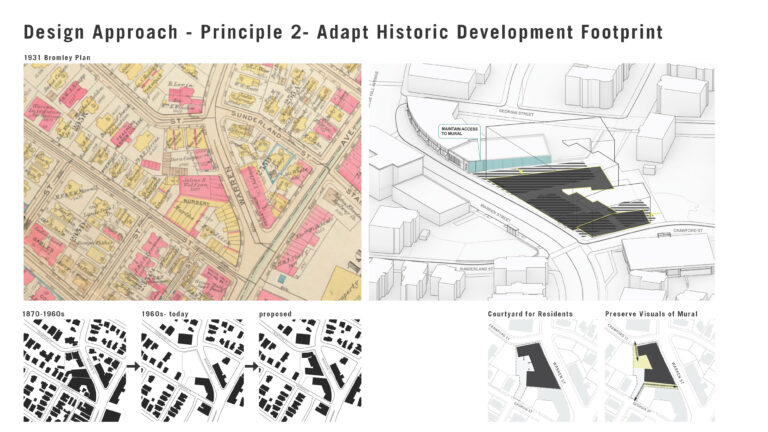
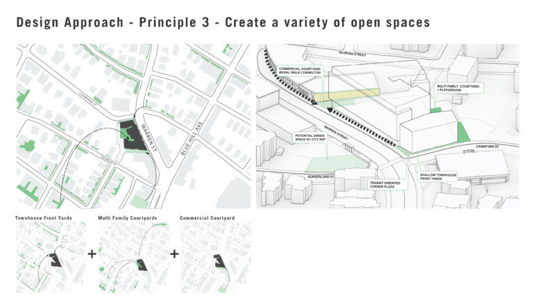
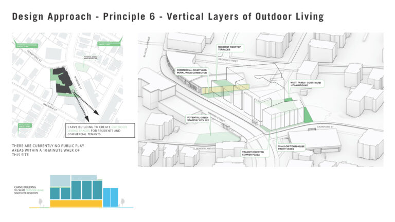
For instance, one of the Warren Street diagrams addresses different types of open space. It’s based on analysis and research that we performed into what the site conditions are and what types of green spaces exist in the area. Being able to visualize our research this way and to track how we’ve implemented it in the project and see how it’s shaping the design gives us a much deeper and clearer understanding.
This also helps us throughout the process when we’re working with public agencies, like the Mayor’s Office of Housing and the Boston Planning Development Agency, as well as with communities, to translate ideas through design. These are both a tool for us in terms of evaluating our design and being able to think critically about its efficacy, while also helping us to communicate outwards and get everybody aligned on the objectives of the project.
How has diagramming been used historically, and what can we learn from that?
Mapping and diagramming have historically been used in urban design as a way to communicate structures of power, rather than as a way to promote the collective good. Take redlining maps for example — those were maps and diagrams that have ultimately caused harm. As architects and designers, we need to be cognizant of the power that mapping and diagramming can have and make sure that we’re doing it from a perspective where we’re not trying to do harm or exclude communities, but rather to understand their perspectives and work with care and intention. At Studio Luz, we are always aware of avoiding the didactic model of imposing something on a site, and instead use these tools as a way to bring to light things that may not be immediately visible. Centering the community is really critical, especially when you’re working in cities and communities that have been negatively impacted by urban planning practices in the past.

How does iteration come into play when creating diagrams?
Iteration is all about refining solutions as the project evolves, and that applies to diagrams as well. Essentially, we’re thinking through the problem we’re addressing over and over again, and updating our output based on our new understanding of the information. We apply this concept to everything across a project, from the overall building design to the most minute building detail. It’s across all scales, from the macro high-level concept to the details that help us meet performance goals. Thinking these through and being open to changing them as we go is essential to a project’s success.
Walk us through Studio Luz’ process when collecting information for a diagram.
The diagram is a tool for us to document our understanding of a place. Any diagram we create is grounded in a lot of research, though that looks very different project to project. Sometimes that means looking at historic maps of the site and trying to understand historic development footprints, and sometimes it means walking around the neighborhood and having a physical personal experience there — oftentimes it means all of the above.
When it comes to collecting current information on a site, what you see differs based on the medium — for instance, a Google Maps walkthrough is going to give you different information than what you might get from walking around and having conversations. Our steering committee members and their insights are absolutely critical for understanding the fabric of a neighborhood. There are insights that you get from the residents’ lived experience that go beyond what we can observe off of a map or from a bird’s eye view.
It’s important to think outside the box in terms of what data looks like. Mapping the experience of the place, including things like how loud the area is and the phenomenological qualities of the light, helps ground information that can be more abstract and ephemeral. There are lots of opportunities to be creative with that, and to weave all of your findings together in a compelling way.
What would you say are some important things to keep in mind when working with diagrams?
Keep your diagram simple and the intent clear. If you try to visualize too many things in one diagram, the message gets lost in the layers. Synthesizing the core idea and then creating multiple diagrams if you need to is the way to go. Personally, I find that extracting information as different layers and not just trying to have one diagram that shows everything helps to deepen my understanding, because being able to turn those layers on and off to compare can reveal interesting overlaps and synergies that you wouldn’t have seen otherwise and uncover a new perspective.
Don’t be too attached to what you think the diagram is going to show. Instead, keep an open mind to whatever the information has to show you, and then adjust based on that. The diagram will reveal new things, sometimes even something better than you could have initially thought you were diagramming, which then offers an opportunity to redesign and rethink and offer a better solution.
Lastly, remember the audience that you’re communicating with via the diagram. There are diagrams you make internal use, and then there are diagrams you make to share with the public, and there are different considerations you need to make for each.
What are some tools you use to create diagrams?
There are some really useful mapping tools available, including ArcGIS StoryMaps, which allows users to transform maps and geographic information system work into interactive content. We recommend looking into these valuable resources when getting started on diagramming.